Більш розширений підхід до аналізу даних звіту
HelpCrunch надає ряд вбудованих звітів, але іноді потрібна більш глибока аналітика і більш кастомізовані звіти. Цей посібник покаже вам, як це зробити:
- Експортуйте вихідні дані зі звітів HelpCrunch.
- Фільтруйте, сортуйте та аналізуйте дані в Excel або Google Sheets.
- Створюйте власні звіти (по клієнтам, тегам, продуктивності тощо).
- Використовуйте HelpCrunch REST API для розширеного звітування, включаючи автоматизовані звіти, об'єднання даних та інтеграцію з інструментами бізнес-аналітики.
Експортування даних звіту
Ви можете експортувати звіти HelpCrunch у форматі CSV або Excel і аналізувати їх у будь-якому інструменті для роботи з електронними таблицями.
Як зробити експорт даних:
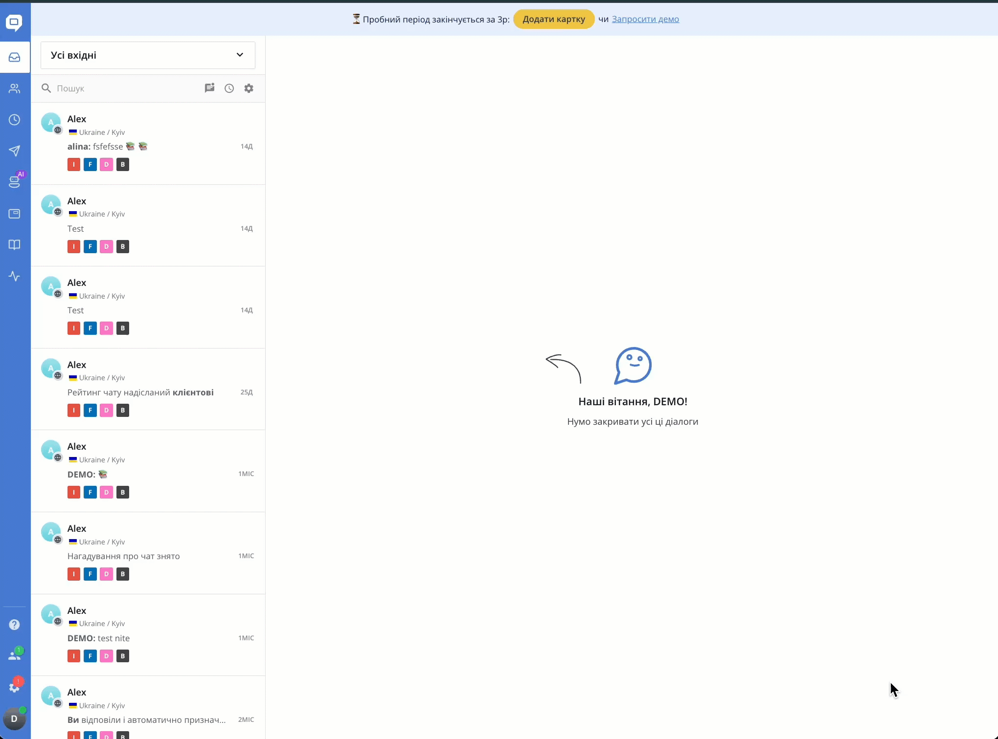
- Відкрийте розділ Звіти в HelpCrunch.
- Оберіть потрібний звіт (Члени команди, Звіт по відділах тощо).
- Оберіть діапазон дат і конкретного агента (або завантажте по всій команді).
-
Натисніть на цифри інтерактивних звітів, щоб перейти до чатів.
- Натисніть на меню вгорі (три крапки) і оберіть Експортувати CSV на електронну пошту.
- Отримавши електронний лист, відкрийте прикріплений файл у Microsoft Excel, Google Sheets або іншому інструменті.
.gif)
1. Можливо, ваш екран занадто вузький (наприклад, якщо ви користуєтесь телефоном). Спробуйте прокрутити бічну панель, щоб побачити всі елементи.
2. Також можливо, що у вас обмежені права доступу — за замовчуванням звіти можуть переглядати лише Адміністратори та Супервізори. Проте Адміністратор може створити власну роль із доступом до звітів.
Якщо ви вважаєте, що повинні мати доступ, зверніться до свого Адміністратора команди.
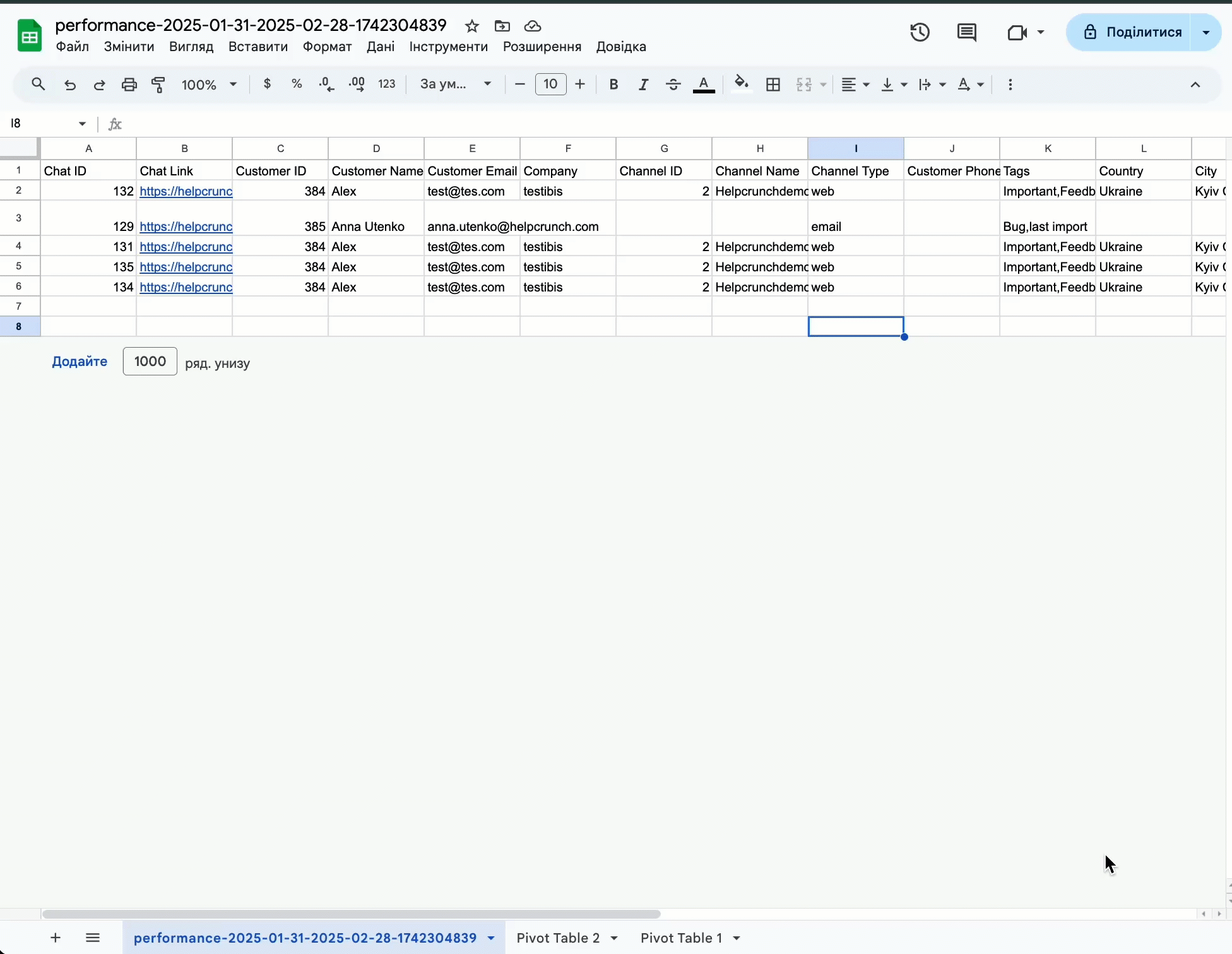
Фільтрування та аналіз даних у Microsoft Excel, Google Sheets або іншому інструменті
Після експорту даних ви можете фільтрувати, сортувати та обробляти їх.
Фільтрування даних
Для швидкого пошуку потрібних даних:
- Відкрийте експортований файл в Excel.
- Виділіть рядок заголовка → натисніть Фільтр (Ctrl + Shift + L у Windows, Cmd + Shift + L у Mac).
- Натисніть на випадаючий список у будь-якому стовпчику, щоб відфільтрувати:
- Date - аналіз за певний період.
- Assignee - для відстеження ефективності конкретних членів команди.
- Customer - щоб бачити всі взаємодії за кожним клієнтом.
- Tags - для аналізу найпоширеніших проблем/запитів.
- Channel - для аналізу звернень за каналами зв'язку
.gif)
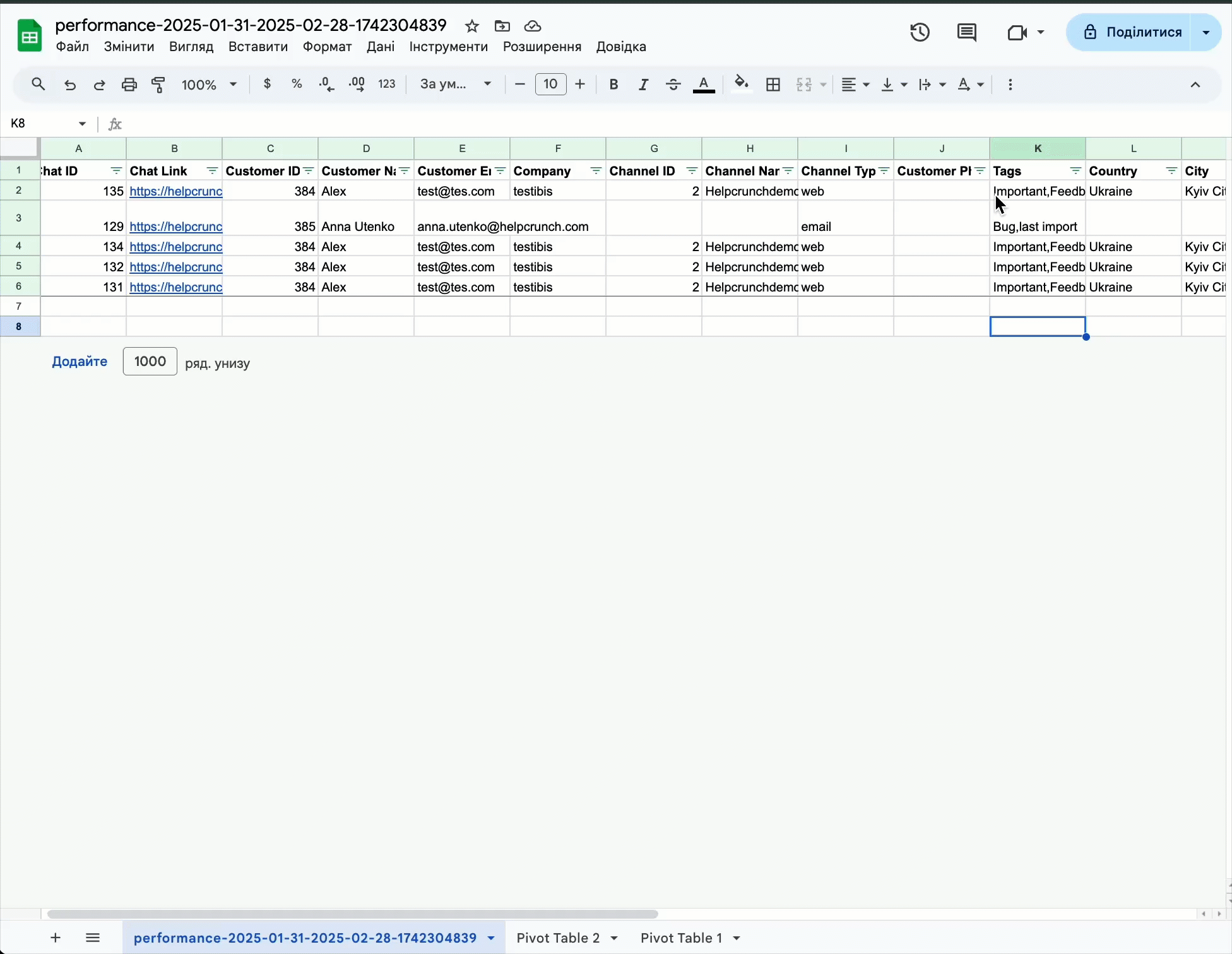
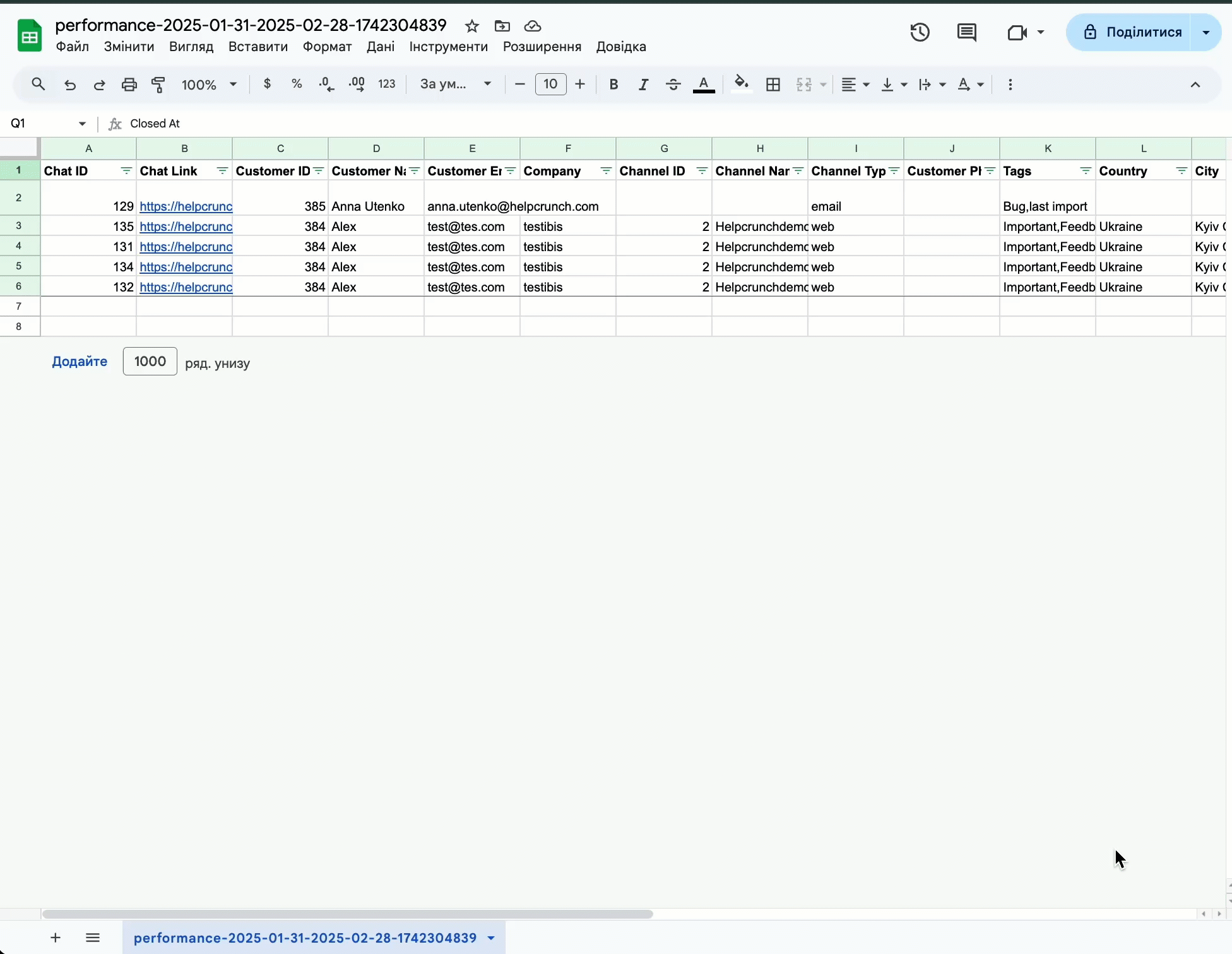
Сортування даних
Впорядкувати дані для більшої зручності:
- Оберіть стовпець (наприклад, First response time, Status, Tags).
- Натисніть Сортувати A-Я або Сортувати Я-А в Excel.
.gif)
Зведені таблиці для побудови власного звіту
Зведені таблиці допомагають систематизувати великі масиви даних:
- Виділіть потрібний набір даних → натисніть Вставити → Зведена таблиця.
- Додайте потрібні поля, наприклад, Assignee (Ім'я призначеного оператора) → Рядки, Channel ID → Значення.
- Додайте фільтри, щоб зосередитися на певних періодах або агентах.
.gif)
Створення спеціальних звітів
Ось кілька практичних прикладів кастомних звітів, які ви можете створити:
📊 Звіт по клієнту
Відстежуйте, скільки взаємодій зі службою підтримки має конкретний клієнт.
- Фільтруйте за ідентифікатором клієнта, назвою компанії або електронною поштою.
- Створіть зведену таблицю для підрахунку взаємодій за кожним клієнтом.
- Порівняйте час відповіді для кожного клієнта, щоб визначити пріоритетних клієнтів.
🏷 Звіти на основі тегів
Оцініть, які теми чи проблеми викликають найбільше запитів на підтримку.
- Відфільтруйте набір даних за тегами (наприклад, « Оплата», «Технічна проблема»).
- Підрахуйте загальну кількість випадків для кожного тегу, щоб виявити типові запити.
- Порівняйте, як типи запитів змінюються з часом.
📅 Звіт про роботу агента
- Фільтруйте за іменем агента, щоб побачити загальну кількість розмов на співробітника.
- Вимірюйте середній час відповіді та час вирішення.
- Порівняйте ефективність роботи агента за різні періоди.
Потрібно більше даних? Використовуйте інструменти REST API HelpCrunch
Для ще більшої гнучкості використовуйте HelpCrunch REST API:
🚀 Отримувати дані в реальному часі з HelpCrunch.
📊 Створюйте кастомні звіти з певними параметрами.
У разі виникнення будь-яких питань звертайтеся до нашої команди - ми з радістю вам допоможуть! 🚀