The Appearance section in Knowledge Base Settings lets you control how your Knowledge Base looks and how it’s visually integrated with your brand. These settings affect colors, branding elements, layout density, widget connection, and social links shown to visitors.
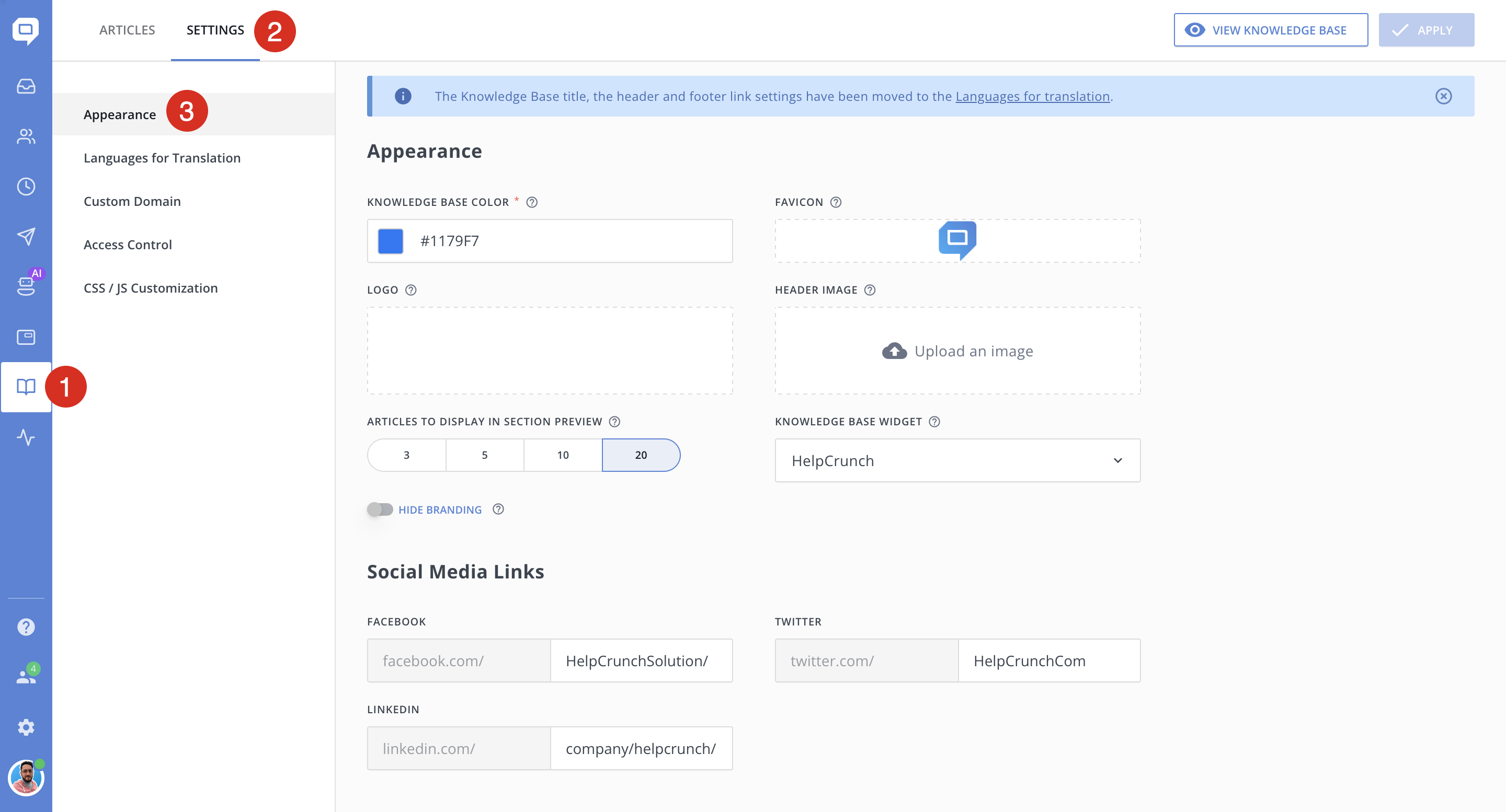
Knowledge Base Color
Defines the primary accent color of your Knowledge Base. You can add a HEX color value (for example, #1179F7).
Favicon
Sets the small icon displayed in the browser tab when users open your Knowledge Base.
Logo
Displays your company logo in the Knowledge Base header.
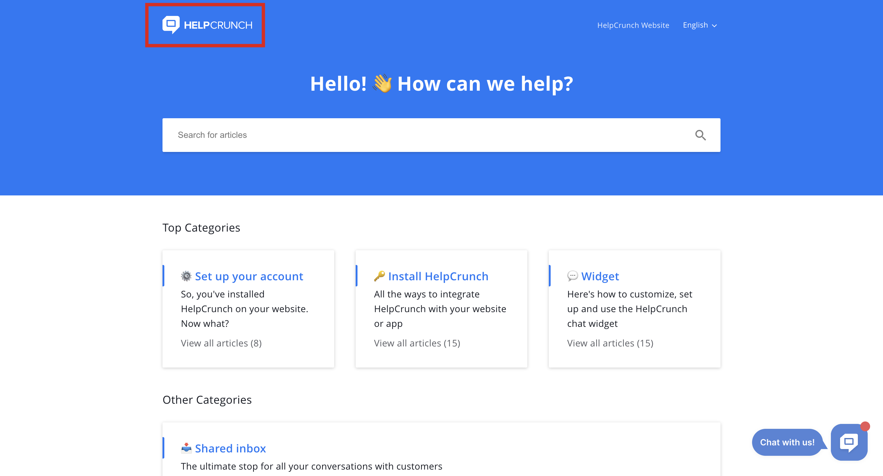
Use a transparent PNG for the cleanest result on different backgrounds.
Header Image
Adds a banner-style image to the top of the Knowledge Base homepage. The image is shown above the categories and sections on the main page.
Articles to Display in Section Preview
Controls how many articles are shown under each section on the Knowledge Base homepage, before the "See all" link.
Available options
-
3 articles
-
5 articles
-
10 articles
-
20 articles
Knowledge Base Widget
Displays a specific chat widget on your knowledge base page. You can select one from the drop-down list.
Hide Branding
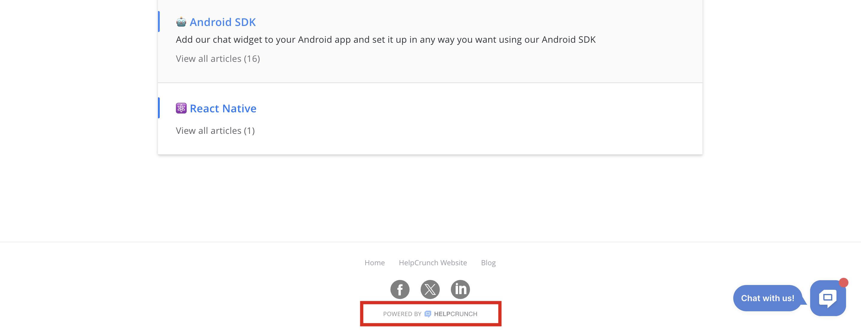
Removes HelpCrunch branding from the Knowledge Base.
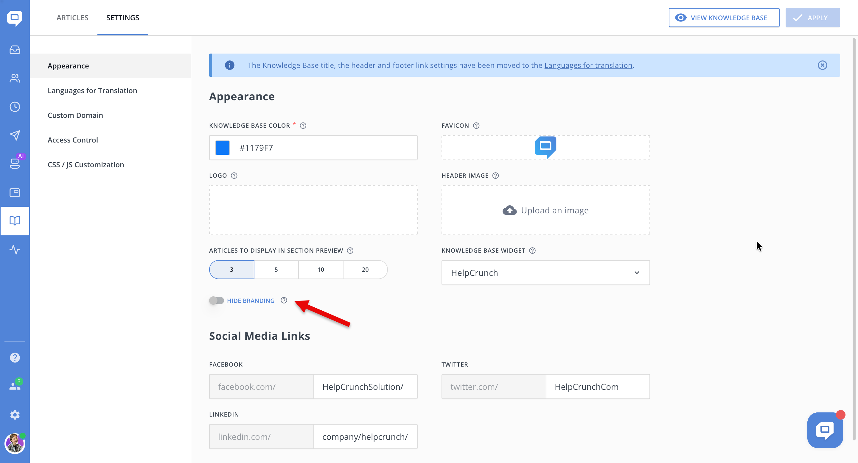
When enabled, HelpCrunch branding is hidden from the footer
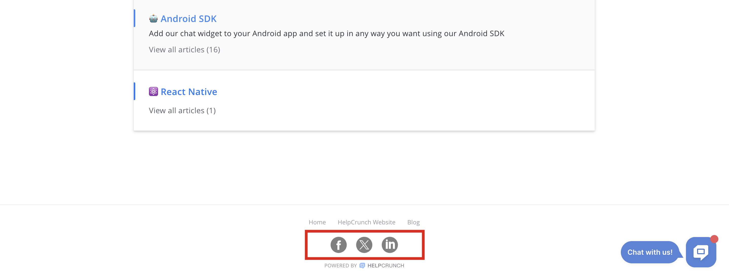
Social Media Links
These links are displayed in the Knowledge Base footer and help users find your company on social platforms (Facebook, Twitter/X, LinkedIn).
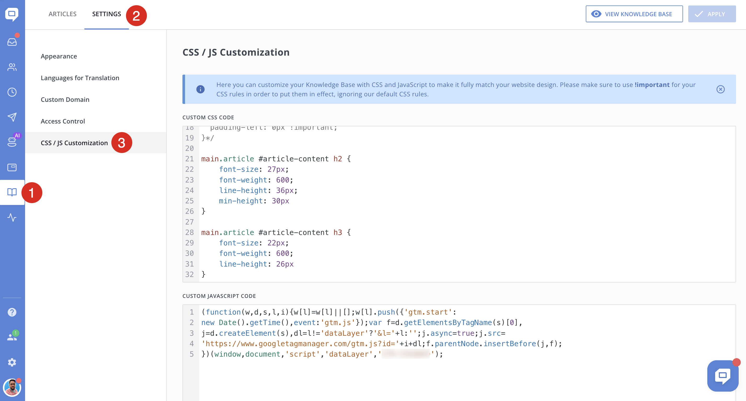
Advanced Knowledge Base Customization with Custom CSS and JavaScript
If the default customization options in the Knowledge Base → Settings → Appearance section are not sufficient, you can go one step further.
HelpCrunch allows you to apply your own custom CSS and JavaScript to fully control the look and behavior of your Knowledge Base.
-
Go to Knowledge Base → Settings.
-
Open the CSS/JS Customization section.
-
Paste your custom CSS or JavaScript code into the corresponding fields and save changes.
What You Can Customize with Custom CSS/JS in Your Knowledge Base
Using custom CSS and JavaScript, you can:
-
Modify layout and spacing
-
Adjust typography beyond default options
-
Override colors and visual elements
-
Hide or restyle specific components
-
Add custom scripts or tracking
-
Implement additional UI behavior
!important in your CSS rules.